Image generators have learned to spell
Image generators can now put readable text on signs, posters and packaging. Cyrillic, and Kazakh letters especially, still come out worse than Latin.
For you: You can draft a poster or ad in a minute, but any Kazakh text on it needs checking letter by letter.
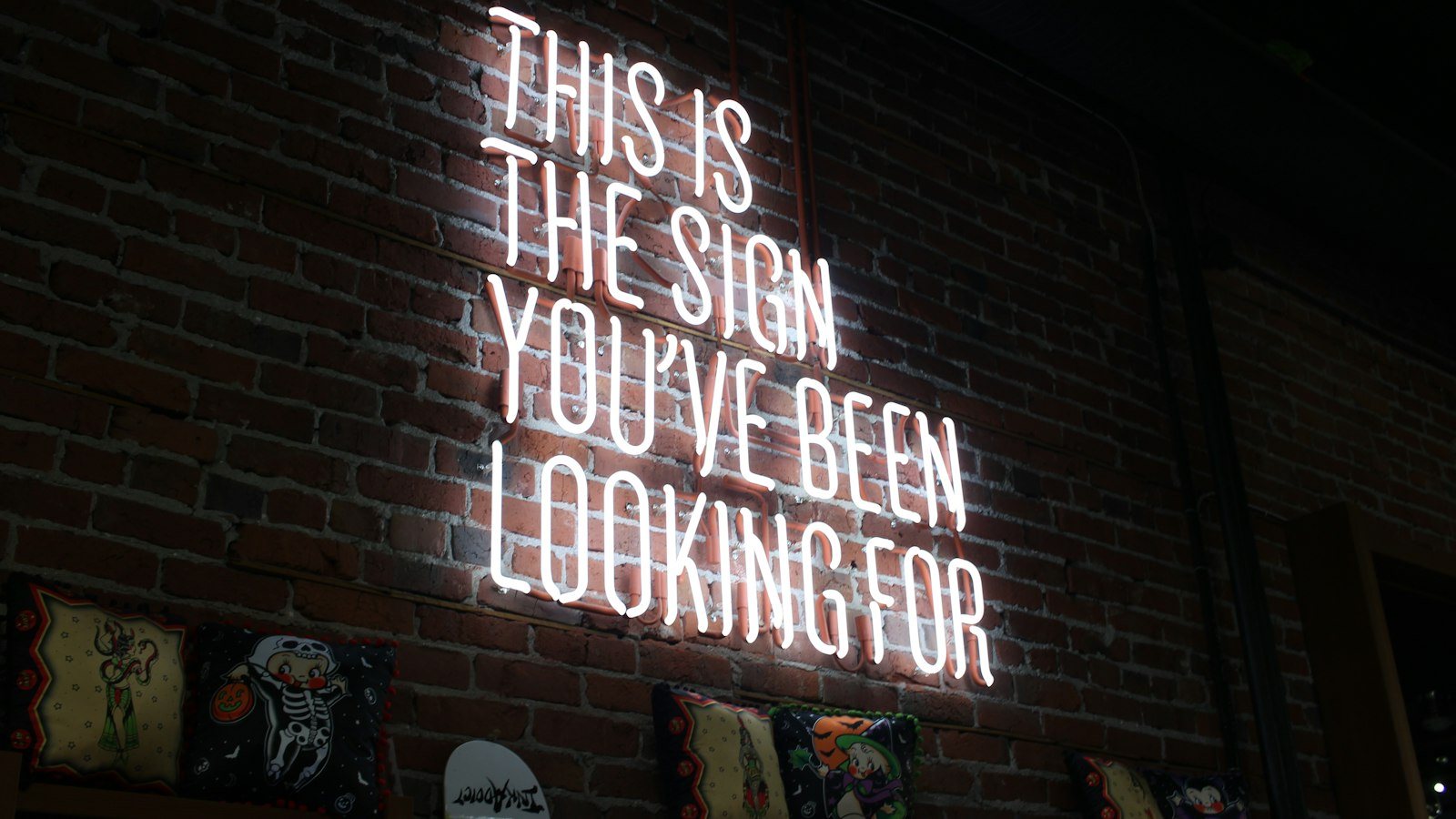
Anyone who has asked an AI for a poster knows the picture. The image looks great, the colours work, but the headline is a row of strange symbols. They look like letters, yet you cannot read them. People used to joke about this “alien lettering”.
That has changed. New image generators have learned to spell. Signs, posters and packaging now come out with readable text. This changes the work of designers, small business owners and social media managers. But there are important limits.
Why it used to fail
Older models drew letters like a pattern. They had seen millions of images, and images are full of text: shop signs, book covers, road signs. The model memorised what writing looks like — lines, curves, rows. But it did not understand that letters carry meaning and are meant to be read.
Hence the result: close, but unreadable. Like an ornament, pretty to look at, but you cannot make words out of it.
What new models learned
New models learned from pictures together with their captions. They saw an image and the text in it at the same time. So the model understands that writing is not just decoration; it has to be legible.
In practice this means:
- the headline you ask for appears in the image with the right letters;
- short text — a name, a slogan, a price — is usually readable on the first try;
- the lettering matches the style of the image: a neon sign, a chalkboard, print on a package.
How designers use it
Designers use this for drafts. Say a coffee shop needs a poster. A designer used to build a few options by hand and spend half a day on it. Now they can get ten poster options with a real headline in a minute and show them to the client.
The client picks a direction: colour, style, layout. Only then does the designer produce the chosen option properly. That saves time and cuts down on arguments, because the client sees up front what they will get.
There is another benefit. It is easier for the client to explain what they want: they can point to a specific option and say “like this, but warmer”.
It is not only designers who benefit. The owner of a small business, such as a bakery or a flower shop, can try out a few ad ideas for a new product on their own. Students can draft an event announcement. A social media manager can quickly choose a direction for a post image. The rule is the same for everyone: this is a starting sketch, not a finished product.
The limits: Cyrillic and Kazakh letters
The main limit matters a lot in Kazakhstan. Cyrillic, and Kazakh letters especially, still come out worse than Latin. Most of the images the models learned from contain Latin script. There is less Cyrillic, and even less Kazakh text with letters such as ә, ғ, қ, ң, ө, ұ, ү, һ and і.
So the model may draw “К” instead of “Қ”, turn “ү” into “у” or double a letter. At first glance it looks fine, and the mistake is only spotted after printing.
The second issue is the font. The final layout is still built by hand, with a properly licensed font. Letters generated by AI do not belong to any real typeface. They are hard to edit or reproduce in other materials. And a brand needs one consistent style across its website, packaging and ads.
What to do now
AI speeds up the draft but does not deliver a finished product. To use it well:
- Put the text in quotation marks. State the exact wording separately in your prompt, so the model tries to reproduce it word for word.
- Keep the text short. One or two words work better than a long phrase.
- Check every letter. Especially ә, ғ, қ, ң, ө, ұ, ү and і.
- Make a version without text. If the Kazakh lettering will not come out right, take the background from the AI and add the text yourself in a graphics editor.
- Build the final version with a licensed font.
For a draft, copy this prompt and replace what is in brackets:
Create a vertical poster. The headline must read exactly: “[text, for example AUTUMN FAIR]”. No other text on the poster. Style: [for example, minimalist, warm colours]. Background: [for example, an autumn park]. Make the headline large, legible and placed at the top. Give me 4 different options.When you get the result, compare the headline letter by letter. If there is a mistake, ask for a new option or add the text yourself.
Image generators have sped up draft work. But the final word, including whether the Kazakh letters are right, still belongs to a person.
Comments
Sign in to leave a commentNo comments yet. Be the first.